Tuesday 23 November 2010

Abram Games

        I found a lot of the work in the Restless times Exhibition gallery quite dull and depressing in comparison to some of Abram Games' artwork however some of Games' work was based on war so there was similarities in the way that some of the work was dark and quite saddening. The restless times exhibition was interesting, it showed art from times where this country was facing war and a time when displaced people from all over Europe settled here bringing new artists and ideas to Britain, allot of the paintings and sculptures seemed to reflect the gloominess that the war brought. The Abram games exhibition had its own fair share of gloomy artwork but at the same time there was allot of vibrant images which made the exhibition not as depressing as the Festival of Britain exhibition. The massive range of typography interested me in Games' work and how he had used it to create a huge variety of images.

I liked how he used the typography to add different effects to the final image and also seeing his plan sheets and the work he did previous to the final piece was interesting. Some of his images were not clear what the text said and i found myself tilting my head and sort of solving the puzzle in the image as his work is not always straight forward fonts and colours but this is what i enjoyed about it.


The way he has thought to use different images and objects to represent a letter or number or the way he creates great visual pieces of work from just text and block colours is what made me enjoy his work the most, however not all of Abram Games' work is bright colours and texts as some have quite a dark depressing feel to them such as the war posters like 'Give Clothing for liberated Europe' Piece.

Throughout the day i did sketches of my favourite pieces in the galleries, these where 'Give clothing' and '1981 Gestetner' by Abram Games, The 'Teatopia' exhibition in the Millennium galleries ( My favourite image out of this exhibition was the 'tea bath' tea towel design by Geo law ) and a simplistic black and white design of different cups by Megan Price.
Tuesday 16 November 2010

I WISH I'D DONE THIS

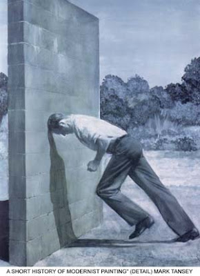
The title of the article is what made me read through it, I wanted to know what the author was referring to. I was staring at the image that was with the article for a few minutes after reading the text and just thinking about how the painter had done it.

The writer talks about how the artist Mark Tansey inspired the way he now paints. Mark Tansey works opposite to most painters and doesn't start with a blank canvas, instead he starts with a canvas covered in paint and removes layers of it to create his shading and outlines and detail on the image. After looking through some of Tansey's work i couldn't help being impressed with the outcome he has with the method of painting he uses.

The Chaps for Apps.

The article is about a pair of designers, Matt miller and John Sinclair, who have gradually moved up in the design world and now have a successful business that started off as 2 and is now run by 51 people. Also the designers have opened a second studio in Malmo, Sweden so they can be closer to the Sony Ericson HQ as they are now 'design partner' of the company.


 I was interested in the article because it showed the steps of being a designer and it showed how starting off small can lead to bigger things. The designers have worked with the company Sony on different user interfaces and a lot of their work will have been seen all over the work without people realising who has created it. One of the comments i found interesting was ''One of the problems we face as a company is that, although we work on some of the biggest and best user interface projects for global brands, we're not actually allowed to showcase that work,''. I would find it hard to design something and not be able to put my name to it or get recognition from it, it would feel like the major company using my design was taking credit for it, however if large company's did use your work it would give you a good reference to take on to other organisations and show them the level of quality you work at. The designers also talk about starting off doing designs for the mobile phone company Sony Ericson and at the time it was ''embarrassing'' for them telling people as mobile phones were not as technologically advanced as they are now, ''because phones used to look crap.'', but now they are doing work with massive companies, such as apple designing apps for the hugely popular iphone series.

http://designdust.tumblr.com

A friend introduced me to this blog and i decided to chose it as one of my 5 to review. When i first started reading through the posts and viewing the images and videos it felt refreshing and natural. The blog posts are very unique and the majority of the content is clever designs and creative projects. Some of the ideas people have come up with seem simple yet ingenious and i loved how people had used collections of inanimate objects arranged in different ways to create an overall stunning final piece of art. I am a fan of the white background and colourful posts combination as you can probably tell from the selection of blogs i have chosen to review, but this one is much more appealing to me then others.

http://jorgemv.tumblr.com/

The fictional hand drawn character on the homepage of the blog got my attention as soon as i clicked onto the blog, also the navigational layout was different from allot of blogs i had seen. The content on the blog  is the blog owners personal work, digital and hand drawn, some of the posts were designs in their early stages and it was interesting to see how the designer got from one stage to another. The fantasy aspect to some of his images really interested me and i enjoyed what seemed like a step into the blogger's imagination. I enjoy drawing fantasy characters and other cartoons also so it will be interesting to compare my images to the posts on this blog.

http://graphiceverywhere.tumblr.com/

I chose this as my third blog to review because of the clever and interesting style throughout the blog. Allot of the posts on this blog are smart and tasteful, also it can take a while to actually fully see what the picture is showing or understand the meaning behind it. Some of the posts don't necessarily have a hidden message or meaning behind them, it is simply well designed illustrations/graphic work. The blog follows the simplistic white background and dark font like quite a few others i have seen but it really does emphasise the images on the blog.


For my second blog to review I have chosen Http://doodlebook.tumblr.com/. Like the first blog I chose this one caught my eye with the black and white, simple, line art images in the background and the basic layout. I enjoyed scrolling through all the images that have been posted and there seemed to be a consistent style in the majority of the content on the blog. Another thing I enjoyed about the blog was the cartoons and comical side to some of the images and the characters drawn are creative and original in some of the posts. I picked this blog over others because of the way the images are described as doodles which are mindless drawings and random creations also the person who posts the doodles gives an insight to their image and explains what inspired them underneath the post.


For my first blog to review I chose Http://getaloadageo.blogspot.com/.
The blog is minimalistic and basic but the black text and outlines of his images contrast well with the white background. His images are mainly created with light pastel colours and line art, also there seems to be a theme throughout his work. His style of work is simplistic and clean and this works well with the smooth block colours he uses in some of his pieces. In some of his other work he uses wild and bright colours to detail certain areas but the contrast of black and white he often uses stands out the most. I enjoyed reading about artists and work he is involved with and he often updates his blog with upcoming events and work he is doing. As a younger designer his work is modern and current so I find it easy to relate with.

Tuesday 9 November 2010

Bad Dandruff Exhibition.


This is one of my favourite images by Geo Law, i love how he used his signature swirls and characters as the beard for the face. I think his style is unique and his images seem to flow very well.

Millennium Gallery.


Teatopia: To Dry For

At the Millennium Gallery in Sheffield the pink background of one of the exhibitions drew me in the most but one of the central designs in particular caught my eye. It was birds sitting around a tea cup and the the rest of the design was filled with a flowing swirl design. The design was black and white apart from a small amount of colour where the tea was on the image. I quickly sketched the design but didn't manage to get the artists name. Back at college i tried ever Google search possible that related to the image and finally found the artist. Geo Law is the designer of the tea towel and after reading through his blog and viewing some of his pieces i realized that i had seen some of his work before around Sheffield and a lot of it i liked. I love the style he uses and his signature swirls on his images add a great effect to a lot of his simplistic pastel coloured images. I think his designs would work well on t-shirts or other clothing items.